The most useful starting question for a business website is simple: what is the visitor trying to do right now? A person deciding where to eat has different needs from someone looking for a tow truck. The structure should make that difference visible.
Design for the situation, not just the industry.
Someone comparing restaurants might want the menu, opening hours, directions, or a way to order. Someone looking for towing may be standing beside a vehicle with one hand available and little patience for a long introduction. In each case, the first screen needs to help with the immediate task.
That does not mean every page needs a bigger button. It means the page needs a priority. If every link has the same emphasis, the visitor has to decide what you consider important before they can make their own decision.
Two businesses, two useful paths.
Wagyu Shawarma Grill brings menu browsing, online ordering, catering, and location information together. A guest can choose the route that matches the occasion. The ordering destination is a real next step, rather than a decorative button that ends at another introduction.
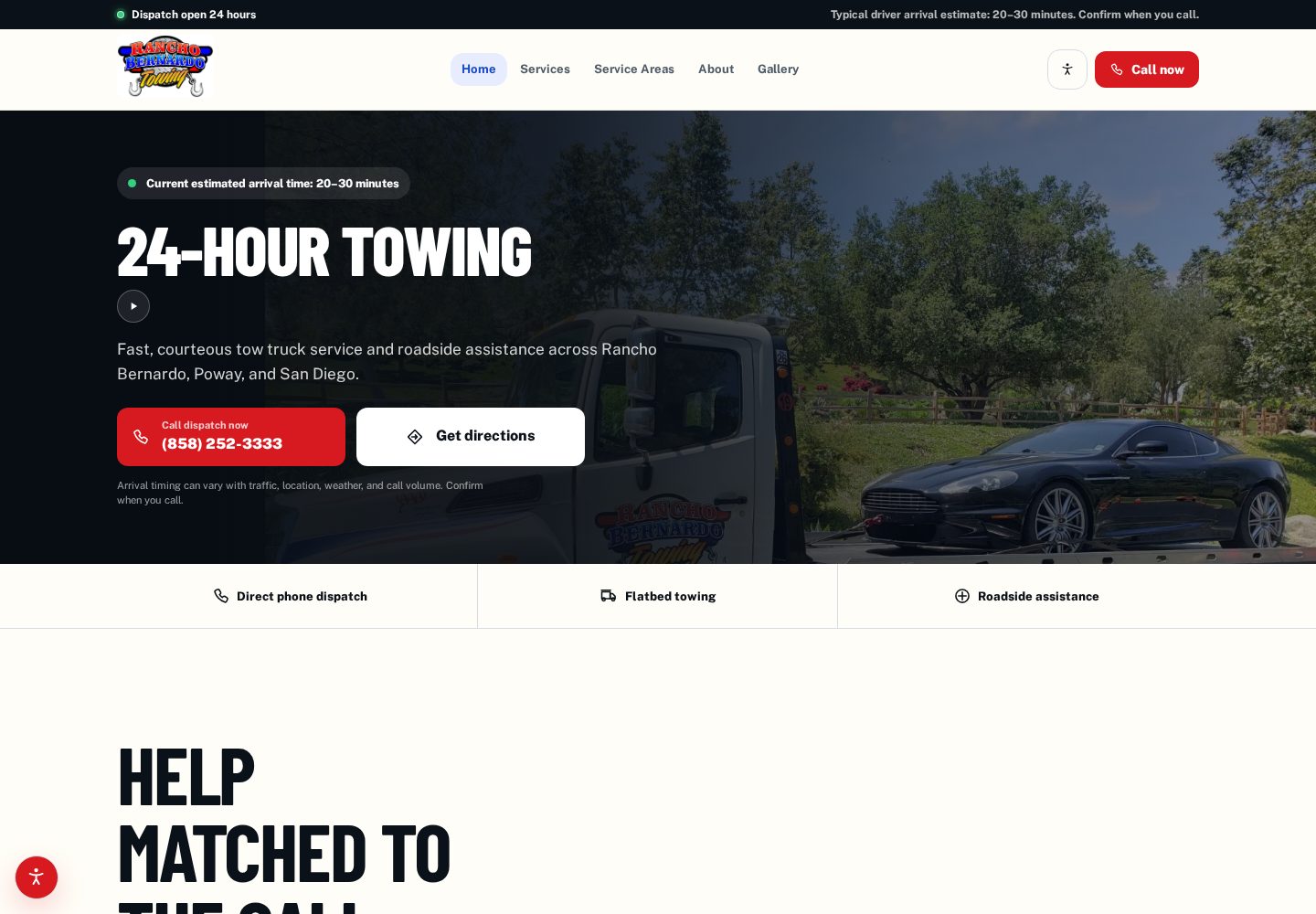
Rancho Bernardo Towing puts direct calls alongside service information and a gallery of actual work. A visitor can contact dispatch or check whether a service fits the situation. The website supports the decision without making someone complete an unnecessary form first.
Put practical details near the action.
A call button is more useful when the visitor knows who will answer and what to ask. A directions link is more useful beside a clear address. An order link is more useful when the guest understands where it will take them. Context makes a short action feel understandable.
- Use descriptive labels such as View the menu, Call dispatch, or Request a consultation.
- Keep contact details available as text as well as links.
- Check every phone, map, and ordering destination on a real mobile-sized screen.
- Make hours, service areas, and availability easy for the business to keep accurate.
Try the first-minute test.
Open your website as though you have never seen it. Can you explain what the business does, decide whether it fits, and find the next step? Repeat that check from a service page rather than the homepage. Search visitors do not always enter through the front door.
A stronger website often starts by removing a detour. Once the main path is clear, the photography, copy, and design can reinforce it instead of competing with it.